Visualize Label Distribution
Learn how to visualize and compare partitioned datasets when applying different Partitioners or parameters.
If you partition datasets to simulate heterogeneity through label skew and/or size skew, you can now effortlessly visualize the partitioned dataset using flwr-datasets.
All the described visualization functions are compatible with all Partitioner you can find in flwr_datasets.partitioner
Install Flower Datasets
[ ]:
! pip install -q "flwr-datasets[vision]"
Plot Label Distribution
Bar plot
Let’s visualize the result of DirichletPartitioner. We will create a FederatedDataset and assign DirichletPartitioner to the train split:
[ ]:
from flwr_datasets import FederatedDataset
from flwr_datasets.partitioner import DirichletPartitioner
from flwr_datasets.visualization import plot_label_distributions


fds = FederatedDataset(
    dataset="cifar10",
    partitioners={
        "train": DirichletPartitioner(
            num_partitions=10,
            partition_by="label",
            alpha=0.3,
            seed=42,
            min_partition_size=0,
        ),
    },
)

partitioner = fds.partitioners["train"]
Once we have the partitioner with the dataset assigned, we are ready to pass it to the plotting function:
[ ]:
fig, ax, df = plot_label_distributions(
    partitioner,
    label_name="label",
    plot_type="bar",
    size_unit="absolute",
    partition_id_axis="x",
    legend=True,
    verbose_labels=True,
    title="Per Partition Labels Distribution",
)
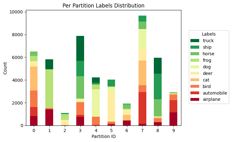
You can configure many details directly using the function parameters. The ones that can interest you the most are:
size_unitto have the sizes normalized such that they sum up to 1 and express the fraction of the data in each partition,legendandverbose_labelsin case the dataset has more descriptive names and not numbers,cmapto change the values of the bars (for an overview of the available colors, have a look at link; check outcmap="tab20b")
And for even greater control, you can specify plot_kwargs and legend_kwargs as Dict, which will be further passed to the plot and legend functions.
You can also inspect the exact numbers that were used to create this plot. Three objects are returned (see reference here). Let’s inspect the returned DataFrame.
[ ]:
df
| airplane | automobile | bird | cat | deer | dog | frog | horse | ship | truck | |
|---|---|---|---|---|---|---|---|---|---|---|
| Partition ID | ||||||||||
| 0 | 817 | 794 | 1462 | 2123 | 432 | 25 | 456 | 384 | 14 | 9 |
| 1 | 1416 | 6 | 97 | 5 | 3 | 0 | 3409 | 0 | 3 | 868 |
| 2 | 0 | 4 | 11 | 2 | 454 | 3 | 511 | 15 | 84 | 21 |
| 3 | 762 | 159 | 1100 | 51 | 120 | 166 | 2 | 1982 | 1351 | 2175 |
| 4 | 2 | 43 | 714 | 2 | 19 | 2400 | 425 | 1 | 151 | 477 |
| 5 | 67 | 79 | 170 | 25 | 2552 | 477 | 27 | 44 | 590 | 0 |
| 6 | 422 | 2 | 4 | 486 | 380 | 92 | 90 | 380 | 50 | 6 |
| 7 | 122 | 2811 | 597 | 2174 | 1038 | 1727 | 1 | 682 | 515 | 4 |
| 8 | 256 | 29 | 342 | 75 | 1 | 84 | 8 | 1511 | 2240 | 1417 |
| 9 | 1136 | 1073 | 503 | 57 | 1 | 26 | 71 | 1 | 2 | 23 |
Each row represents a unique partition ID, and the columns represent unique labels (either in the verbose version if verbose_labels=True or typically int values otherwise, representing the partition IDs). That you can index the DataFrame df[partition_id, label_id] to get the number of samples in partition_id for the specified label_id.
[ ]:
df.loc[4, "bird"]
714
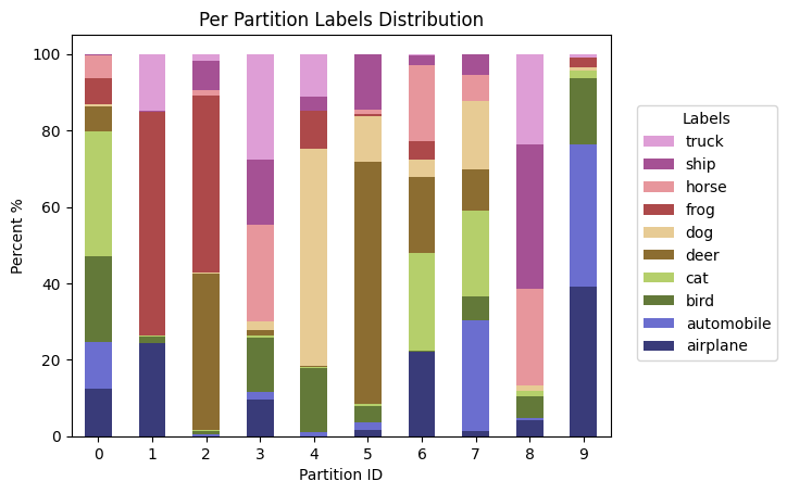
Let’s see a plot with size_unit="percent", which is another excellent way to understand the partitions. In this mode, the number of datapoints for each class in a given partition are normalized, so they sum up to 100.
[ ]:
fig, ax, df = plot_label_distributions(
    partitioner,
    label_name="label",
    plot_type="bar",
    size_unit="percent",
    partition_id_axis="x",
    legend=True,
    verbose_labels=True,
    cmap="tab20b",
    title="Per Partition Labels Distribution",
)
Heatmap
You might want to visualize the results of partitioning as a heatmap, which can be especially useful for binary labels. Here’s how:
[ ]:
fig, ax, df = plot_label_distributions(
    partitioner,
    label_name="label",
    plot_type="heatmap",
    size_unit="absolute",
    partition_id_axis="x",
    legend=True,
    verbose_labels=True,
    title="Per Partition Labels Distribution",
    plot_kwargs={"annot": True},
)
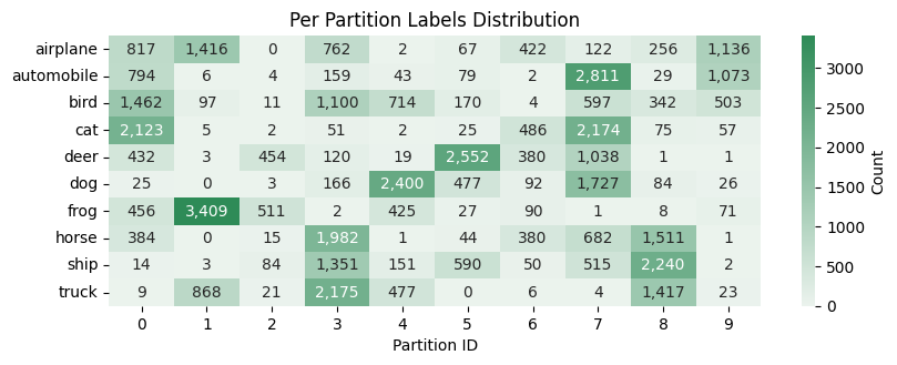
Note: we used the plot_kwargs={"annot": True} to add the number directly to the plot.
If you are a pandas fan, then you might be interested that a similar heatmap can be created with the DataFrame object for visualization in jupyter notebook:
[ ]:
df.style.background_gradient(axis=None, cmap="Greens", vmin=0)
| airplane | automobile | bird | cat | deer | dog | frog | horse | ship | truck | |
|---|---|---|---|---|---|---|---|---|---|---|
| Partition ID | ||||||||||
| 0 | 817 | 794 | 1462 | 2123 | 432 | 25 | 456 | 384 | 14 | 9 |
| 1 | 1416 | 6 | 97 | 5 | 3 | 0 | 3409 | 0 | 3 | 868 |
| 2 | 0 | 4 | 11 | 2 | 454 | 3 | 511 | 15 | 84 | 21 |
| 3 | 762 | 159 | 1100 | 51 | 120 | 166 | 2 | 1982 | 1351 | 2175 |
| 4 | 2 | 43 | 714 | 2 | 19 | 2400 | 425 | 1 | 151 | 477 |
| 5 | 67 | 79 | 170 | 25 | 2552 | 477 | 27 | 44 | 590 | 0 |
| 6 | 422 | 2 | 4 | 486 | 380 | 92 | 90 | 380 | 50 | 6 |
| 7 | 122 | 2811 | 597 | 2174 | 1038 | 1727 | 1 | 682 | 515 | 4 |
| 8 | 256 | 29 | 342 | 75 | 1 | 84 | 8 | 1511 | 2240 | 1417 |
| 9 | 1136 | 1073 | 503 | 57 | 1 | 26 | 71 | 1 | 2 | 23 |
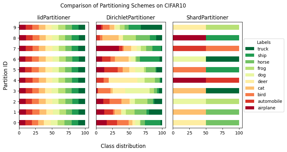
Plot Comparison of Label Distributions
Now, once you know how to visualize a single partitioned dataset, you’ll learn how to compare a few of them on a single plot.
Let’s compare:
IidPartitioner,
DirichletPartitioner,
ShardPartitioner still using the
cifar10dataset.
We need to create a list of partitioners. Each partitioner needs to have a dataset assigned to it (it does not have to be the same dataset so you can also compare the same partitioning on different datasets).
[ ]:
from flwr_datasets import FederatedDataset
from flwr_datasets.partitioner import (
    IidPartitioner,
    DirichletPartitioner,
    ShardPartitioner,
)

partitioner_list = []
title_list = ["IidPartitioner", "DirichletPartitioner", "ShardPartitioner"]

## IidPartitioner
fds = FederatedDataset(
    dataset="cifar10",
    partitioners={
        "train": IidPartitioner(num_partitions=10),
    },
)
partitioner_list.append(fds.partitioners["train"])

## DirichletPartitioner
fds = FederatedDataset(
    dataset="cifar10",
    partitioners={
        "train": DirichletPartitioner(
            num_partitions=10,
            partition_by="label",
            alpha=1.0,
            min_partition_size=0,
        ),
    },
)
partitioner_list.append(fds.partitioners["train"])

## ShardPartitioner
fds = FederatedDataset(
    dataset="cifar10",
    partitioners={
        "train": ShardPartitioner(
            num_partitions=10, partition_by="label", num_shards_per_partition=2
        )
    },
)
partitioner_list.append(fds.partitioners["train"])
Now let’s visualize them side by side
[ ]:
from flwr_datasets.visualization import plot_comparison_label_distribution

fig, axes, df_list = plot_comparison_label_distribution(
    partitioner_list=partitioner_list,
    label_name="label",
    subtitle="Comparison of Partitioning Schemes on CIFAR10",
    titles=title_list,
    legend=True,
    verbose_labels=True,
)
Bonus: Natural Id Dataset
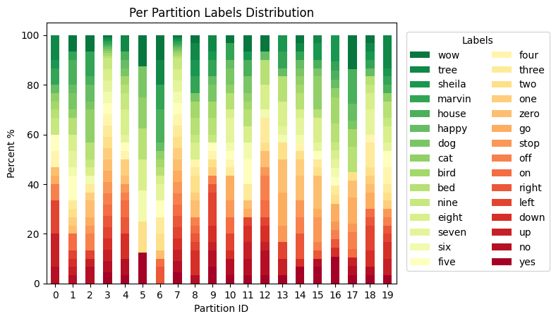
Nothing stops you from using the NaturalIdPartitioner to visualize a dataset with the id in it and does not need the artificial partitioning but has the pre-existing partitions. For that dataset, we use NaturalIdPartitioner. Let’s look at the speech-commands dataset that has speaker_id, and there are quite a few speakers; therefore, we will show only the first 20 partitions. And since we have quite a few different labels, let’s specify legend_kwargs={"ncols": 2} to
display them in two columns (we will also shift the legend slightly to the right).
You’ll be using the Google SpeechCommands dataset, which is a speech-based dataset. For this, you’ll need to install the "audio" extension for Flower Datasets. It can be easily done like this:
[ ]:
! pip install -q "flwr-datasets[audio]"
With everything ready, let’s visualize the partitions for a naturally partitioned dataset.
[ ]:
from flwr_datasets import FederatedDataset
from flwr_datasets.partitioner import NaturalIdPartitioner
from flwr_datasets.visualization import plot_label_distributions


fds = FederatedDataset(
    dataset="google/speech_commands",
    subset="v0.01",
    partitioners={
        "train": NaturalIdPartitioner(
            partition_by="speaker_id",
        ),
    },
)

partitioner = fds.partitioners["train"]

fix, ax, df = plot_label_distributions(
    partitioner=partitioner,
    label_name="label",
    max_num_partitions=20,
    plot_type="bar",
    size_unit="percent",
    partition_id_axis="x",
    legend=True,
    title="Per Partition Labels Distribution",
    verbose_labels=True,
    legend_kwargs={"ncols": 2, "bbox_to_anchor": (1.25, 0.5)},
)
More resources
If you are looking for more resources, feel free to check:
flwr-datasetdocumentationif you want to do any custom modification of the returned plots
or plot directly using pandas object pd.DataFrame.plot
This was the last tutorial.
Previous tutorials: